TLDR; I show how you can visualize the knowledge distribution of your source code by mining version control systems → Results
Introduction
In software development, it’s all about knowledge – both technical and the business domain. But we software developers transfer only a small part of this knowledge into code. But code alone isn’t enough to get a glimpse of the greater picture and the interrelations of all the different concepts. There will be always developers that know more about some concept as laid down in source code. It’s important to make sure that this knowledge is distributed over more than one head. More developers mean more different perspectives on the problem domain leading to a more robust and understandable code bases.
How can we get insights about knowledge in code?
It’s possible to estimate the knowledge distribution by analyzing the version control system. We can use active changes in the code as proxy for “someone knew what he did” because otherwise, he wouldn’t be able to contribute code at all. To find spots where the knowledge about the code could be improved, we can identify areas in the code that are possibly known by only one developer. This gives you a hint where you should start some pair programming or invest in redocumentation.
In this blog post, we approximate the knowledge distribution by counting the number of additions per file that each developer contributed to a software system. I’ll show you step by step how you can do this by using Python and Pandas.
Attribution: The work is heavily inspired by Adam Tornhill‘s book “Your Code as a Crime Scene”, who did a similar analysis called “knowledge map”. I use the similar visualization style of a “bubble chart” based on his work as well.
Import history
For this analysis, you need a log from your Git repository. In this example, we analyze a fork of the Spring PetClinic project.
To avoid some noise, we add the parameters --no-merges and --no-renames, too.
git log --no-merges --no-renames --numstat --pretty=format:"%x09%x09%x09%aN"
We read the log output into a Pandas’ DataFrame by using the method described in this blog post, but slightly modified (because we need less data):
import git
from io import StringIO
import pandas as pd

# connect to repo
git_bin = git.Repo("../../buschmais-spring-petclinic/").git

# execute log command
git_log = git_bin.execute('git log --no-merges --no-renames --numstat --pretty=format:"%x09%x09%x09%aN"')

# read in the log
git_log = pd.read_csv(StringIO(git_log), sep="\x09", header=None, names=['additions', 'deletions', 'path','author'])

# convert to DataFrame
commit_data = git_log[['additions', 'deletions', 'path']].join(git_log[['author']].fillna(method='ffill')).dropna()
commit_data.head()
Getting data that matters
In this example, we are only interested in Java source code files that still exist in the software project.
We can retrieve the existing Java source code files by using Git’s ls-files combined with a filter for the Java source code file extension. The command will return a plain text string that we split by the line endings to get a list of files. Because we want to combine this information with the other above, we put it into a DataFrame with the column name path.
existing_files = pd.DataFrame(git_bin.execute('git ls-files -- *.java').split("\n"), columns=['path'])
existing_files.head()
The next step is to combine the commit_data with the existing_files information by using Pandas’ merge function. By default, merge will
- combine the data by the columns with the same name in each DataFrame
- only leave those entries that have the same value (using an “inner join”).
In plain English, merge will only leave the still existing Java source code files in the DataFrame. This is exactly what we need.
contributions = pd.merge(commit_data, existing_files)
contributions.head()
We can now convert some columns to their correct data types. The columns additions and deletions columns are representing the added or deleted lines of code as numbers. We have to convert those accordingly.
contributions['additions'] = pd.to_numeric(contributions['additions'])
contributions['deletions'] = pd.to_numeric(contributions['deletions'])
contributions.head()
Calculating the knowledge about code
We want to estimate the knowledge about code as the proportion of additions to the whole source code file. This means we need to calculate the relative amount of added lines for each developer. To be able to do this, we have to know the sum of all additions for a file.
Additionally, we calculate it for deletions as well to easily get the number of lines of code later on.
We use an additional DataFrame to do these calculations.
contributions_sum = contributions.groupby('path').sum()[['additions', 'deletions']].reset_index()
contributions_sum.head()
We also want to have an indicator about the quantity of the knowledge. This can be achieved if we calculate the lines of code for each file, which is a simple subtraction of the deletions from the additions (be warned: this does only work for simple use cases where there are no heavy renames of files as in our case).
contributions_sum['lines'] = contributions_sum['additions'] - contributions_sum['deletions']
contributions_sum.head()
We combine both DataFrames with a merge analog as above.
contributions_all = pd.merge(
    contributions,
    contributions_sum,
    left_on='path',
    right_on='path',
    suffixes=['', '_sum'])
contributions_all.head()
Identify knowledge hotspots
OK, here comes the key: We group all additions by the file paths and the authors. This gives us all the additions to a file per author. Additionally, we want to keep the sum of all additions as well as the information about the lines of code. Because those are contained in the DataFrame multiple times, we just get the first entry for each.
grouped_contributions = contributions_all.groupby(
    ['path', 'author']).agg(
    {'additions' : 'sum',
     'additions_sum' : 'first',
     'lines' : 'first'})
grouped_contributions.head(10)
Now we are ready to calculate the knowledge “ownership”. The ownership is the relative amount of additions to all additions of one file per author.
grouped_contributions['ownership'] = grouped_contributions['additions'] / grouped_contributions['additions_sum']
grouped_contributions.head()
Having this data, we can now extract the author with the highest ownership value for each file. This gives us a list with the knowledge “holder” for each file.
ownerships = grouped_contributions.reset_index().groupby(['path']).max()
ownerships.head(5)
Preparing the visualization
Reading tables is not as much fun as a good visualization. I find Adam Tornhill’s suggestion of an enclosure or bubble chart very good:

Source: Thorsten Brunzendorf (@thbrunzendorf)
The visualization is written in D3 and just need data in a specific format called “flare“. So let’s prepare some data for this!
First, we calculate the responsible author. We say that an author that contributed more than 70% of the source code is the responsible person that we have to ask if we want to know something about the code. For all the other code parts, we assume that the knowledge is distributed among different heads.
plot_data = ownerships.reset_index()
plot_data['responsible']  = plot_data['author']
plot_data.loc[plot_data['ownership'] <= 0.7, 'responsible']  = "None"
plot_data.head()
Next, we need some colors per author to be able to differ them in our visualization. We use the two classic data analysis libraries for this. We just draw some colors from a color map here for each author.
import numpy as np
from matplotlib import cm
from matplotlib.colors import rgb2hex

authors = plot_data[['author']].drop_duplicates()
rgb_colors = [rgb2hex(x) for x in cm.RdYlGn_r(np.linspace(0,1,len(authors)))]
authors['color'] = rgb_colors
authors.head()
Then we combine the colors to the plot data and whiten the minor ownership with all the None responsibilities.
colored_plot_data = pd.merge(
    plot_data, authors,
    left_on='responsible',
    right_on='author',
    how='left',
    suffixes=['', '_color'])
colored_plot_data.loc[colored_plot_data['responsible'] == 'None', 'color'] = "white"
colored_plot_data.head()
Visualizing
The bubble chart needs D3’s flare format for displaying. We just dump the DataFrame data into this hierarchical format. As for hierarchy, we use the Java source files that are structured via directories.
import os
import json


json_data = {}
json_data['name'] = 'flare'
json_data['children'] = []

for row in colored_plot_data.iterrows():
    series = row[1]
    path, filename = os.path.split(series['path'])

    last_children = None
    children = json_data['children']

    for path_part in path.split("/"):
        entry = None

        for child in children:
            if "name" in child and child["name"] == path_part:
                entry = child
        if not entry:
            entry = {}
            children.append(entry)

        entry['name'] = path_part
        if not 'children' in entry:
            entry['children'] = []

        children = entry['children']
        last_children = children

    last_children.append({
        'name' : filename + " [" + series['responsible'] + ", " + "{:6.2f}".format(series['ownership']) + "]",
        'size' :  series['lines'],
        'color' : series['color']})

with open ( "vis/flare.json", mode='w', encoding='utf-8') as json_file:
    json_file.write(json.dumps(json_data, indent=3))
Results
You can see the complete, interactive visualization here. Just tap at one of the bubbles and you will see how it works.
The source code files are ordered hierarchically into bubbles. The size of the bubbles represents the lines of code and the different colors stand for each developer.
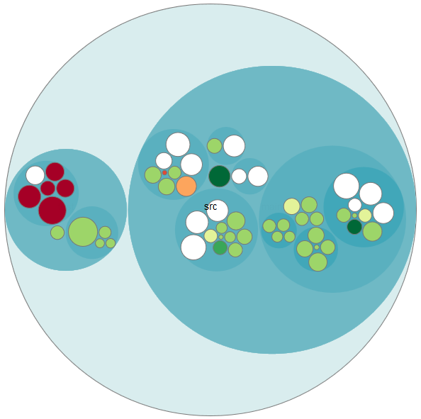
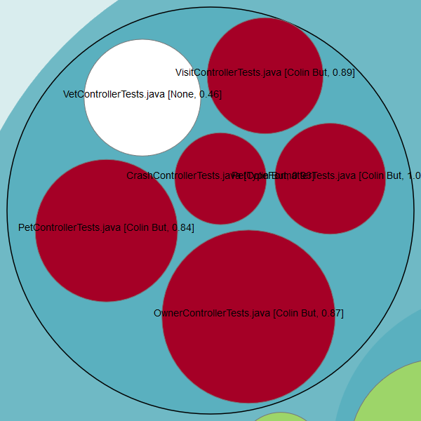
On the left side, you can see that there are some red bubbles. Drilling down, we see that one developer did add almost all the code for the tests:
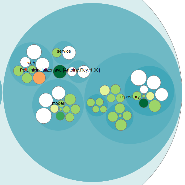
On the right side, you see that some knowledge is evenly distributed (white bubbles), but there are also some knowledge islands. Especially the PetClinicInitializer.java class got my attention because it’s big and only one developer knows what’s going on here:
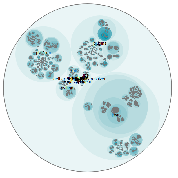
I also did the analysis for the huge repository of IntelliJ IDEA Community Edition. It contains over 170000 commits for 55391 Java source code files. The visualization works even here (it’s just a little bit slow and confusing), but the flare.json file is almost 30 MB and therefore it’s not practical for viewing it online. But here is the overview picture:
Summary
We can quickly create an impression about the knowledge distribution of a software system. With the bubble chart visualization, you can get an overview as well as detailed information about the contributors of your source code.
But I want to point out two points against this method:
- Renamed or split source files will also get new file names. This will “reset” the history for older, renamed files. Thus developers that added code before a rename or split aren’t included in the result. But we could argue that they can’t remember “the old code” anyhow 😉
- We use additions as proxy for knowledge. Developers could also gain knowledge by doing code reviews or working together while coding. We cannot capture those constellations with such a simply analysis.
But as you have seen, the analysis can guide you nevertheless and gives you great insights very quickly.
You can find this notebook on GitHub.
Pingback:My talk at JavaLand 2018 – feststelltaste
Pingback:Identifying lost knowledge in the Linux kernel source code – feststelltaste