Introduction
I recently watched Michael Feathers’ talk about Strategic Code Deletion. Michael said (among other very good things) that if we want to delete code, we have to know the actual usage of our code.
In this post, I want to show you how you can very easily gather some data and create insights about unused code.
Gathering production coverage data
There are many ways to collect some data that fits our needs. You could use some kind of logging or performance profiling. But the easiest way is to use a code coverage tool like JaCoCo or Cobertura (for more tools, have a look at this comparison) for measuring the coverage in production. The common use of those tools is measuring the coverage of the execution paths through tests. But they can also be used to measure the execution paths through the user’s usage.
Using JaCoCo for measuring code coverage in production
In this post, we’ll use the coverage tool JaCoCo. It’s easy to integrate into test execution as well as production systems. You don’t have to instrument your code and create a special artifact, but simply add it as Java agent to your servlet container or application server.
As application example, we use a Spring Petclinic fork that runs in a Tomcat servlet container. We simply build the project and put the WAR file into Tomcat’s webapps directory. Then we add JaCoCo as a Java agent by setting the JAVA_OPTS variable in conf/catalina.bat (on Windows systems):
set "JAVA_OPTS=%JAVA_OPTS% -javaagent:<path_to_lib>\jacocoagent.jar=destfile=C:\Temp\jacoco.exec"After this, we fire up Tomcat and click around in the application, simulating “production usage” (in my case I booked a visit for an owner’s pet). After shutting down Tomcat, we get a jacoco.exec file with the information needed.
Update: @mirumpf asked about the performance overhead of JaCoCo. I’ve measured it by executing the stress test for the Spring Petclinic application with 50 users / threads. The overhead is 18%, which is not negligible at all. I will try to repeat the exercise with an APM tool like Dynatrace or Stagemonitor in the future.
Generate a JaCoCo code coverage report
JaCoCo is usually integrated in the build itself via Maven or Ant to create the report. But there is a nice little library that allows us to do it at the command line. You can download it via the snapshot all in one zip package. There is also a great documentation site available that leaves no question unanswered.
In the end, the command for the report generation is long, but not very special:
java -jar jacococli.jar report <path_to_jacoco.exec> --classfiles <path_to_classfiles_dir> --csv jacoco.csvThis will give you a nice little CSV file with all the coverage information at class level.
Analyzing the coverage report
Let’s have a look into the produced CSV file.
JACOCO_CSV_FILE = r'input/spring-petclinic/jacoco.csv'

with open (JACOCO_CSV_FILE) as log:
    [print(line, end='') for line in log.readlines()[:4]]
It contains the package and class name as well as diverse measures that show use the coverage.
Next, we fire up our favorite data analysis framework Pandas and read in the file.
import pandas as pd
coverage= pd.read_csv(JACOCO_CSV_FILE)
coverage.head(3)
Nice, Pandas recognizes the format of the CSV file automagically!
We don’t need all the information in the CSV file for our purpose, so we just get the relevant columns.
coverage = coverage[['PACKAGE', 'CLASS', 'LINE_MISSED', 'LINE_COVERED']]
coverage.head()
Let’s add some custom measures. For the size of class, we simply add the line information together. Based upon this, we can also calculate the ratio between covered lines and all lines in our code. With this information, we can see which features are used (high values) and which are not in use (low values).
coverage['line_size'] = coverage['LINE_MISSED'] + coverage['LINE_COVERED']
coverage['line_covered_ratio'] =  coverage['LINE_COVERED'] / coverage['line_size']
coverage.head()
That’s all we need! Let’s get to the interesting stuff!
Examing feature usages
The first question we are asking is: Are there any unused features in our application?
In our little example program, we can derive some information about the features in the application based on the class names. We create a list of possible features in a list and check the class names against it. For all the other code that is not in the list we assign the keyword “Framework” to it.
For big software systems, it’s not so easy to derive the implemented features from the pure naming schema, because you will simply have a mess here. But there are sophisticated ways to do this e. g. with jQAssistant, which I will cover in another post.
features = ['Owner', 'Pet', 'Visit', 'Vet', 'Specialty', 'Clinic']

for feature in features:
    coverage.ix[coverage['CLASS'].str.contains(feature), 'feature'] = feature

coverage.ix[coverage['feature'].isnull(), 'feature'] = "Framework"

coverage[['CLASS', 'feature']].head()
By grouping all the classes by their feature and by forming the average of all line covered ratios, we can approximate the feature usage.
feature_usage = coverage.groupby('feature').mean().sort_values(by='line_covered_ratio')[['line_covered_ratio']]
feature_usage
We can see that the “Vet” feature isn’t used very often. If we want to know which classes are affected, we can filter depending on the corresponding feature.
classes_to_delete_by_feature = coverage[coverage['feature'] == feature_usage.index[0]][['PACKAGE', 'CLASS', 'line_covered_ratio', 'line_size']]
classes_to_delete_by_feature
Based on this list, we can approximate how much code we could save if we delete that feature / all the classes.
classes_to_delete_by_feature['line_size'].sum() / coverage['line_size'].sum()
Result: Almost 10% of the code base can be removed if we give up the “Vet” feature.
Examing technology usage
The next question is: Are there technological parts in my software that aren’t used in production at all?
This time, we use the information that is implicitly encoded in the package names. Our heuristic simply takes the last package name as technology related information.
coverage['technology'] = coverage['PACKAGE'].str.split(".").str.get(-1)
coverage[['PACKAGE', 'technology']].head()
Looks good! Then, same game as before, we simply group the classes by the new information.
technology_usage = coverage.groupby('technology').mean().sort_values(by='line_covered_ratio')[['line_covered_ratio']]
technology_usage
There is one part that isn’t used at all: “jdbc”. There is a great chance that in the long term we don’t need that technology anymore. Let’s see how many classes we could probably delete here.
classes_to_delete_by_technology = coverage[coverage['technology'] == technology_usage.index[0]][['PACKAGE', 'CLASS', 'line_covered_ratio', 'line_size']]
classes_to_delete_by_technology
Again, we also calculate the part of these classes regarding our whole application.
classes_to_delete_by_technology['line_size'].sum() / coverage['line_size'].sum()
Result: 32% of the code base can be reduced by simply deleting an unused technology related part.
In summary, we can fairly say that we can delete this amount of code:
print("{:.0%}".format(
    (classes_to_delete_by_feature['line_size'].sum() +
     classes_to_delete_by_technology['line_size'].sum()) /
     coverage['line_size'].sum()))
42! I mean, this is the answer! The answer to (keeping legacy systems a-) life 😀 !
Visualizing the results
But there is one more thing!
We can easily visualize the whole code base including the production coverage measures in a nice hierarchical bubble chart with the JavaScript visualization library D3 to support even more exploration. At this point, kudos to Mike Bostock and Adam Thornhill for their excellent examples!
For the visualization, we need something hierarchical to display. We use the information of the PACKAGE column that contains the Java package name with dots as separator, which fits just perfect as hierachical data. We also need a size measure for the size of the bubbles. We can use the line_size information here that we’ve calculated before. Additionally, we use the colors of the bubbles as identifier for “how much is something covered”. For this, we use matplotlib’s color brewer to assign colors from blue (=cold) to red (=hot) depending of the line_covered_ratio (including the conversion to CSS colors because this is what D3 needs).
So let’s get a new color column first:
import matplotlib.cm as cm
import matplotlib.colors

def assign_rgb_color(value):
    color_code = cm.coolwarm(value)
    return matplotlib.colors.rgb2hex(color_code)

plot_data = coverage.copy()
plot_data['color'] = plot_data['line_covered_ratio'].apply(assign_rgb_color)
plot_data[['line_covered_ratio', 'color']].head(5)
OK, let’s transform our data frame into the hierarchical JSON format “flare” that is needed by D3 to visualize the bubble chart. We just match our columns to more generic names that are used by D3 later on for displaying the various measures:
import json

def create_flare_json(data,
                      column_name_with_hierarchical_data,
                      separator=".",
                      name_column="name",
                      size_column="size",
                      color_column="color"):

    json_data = {}
    json_data['name'] = 'flare'
    json_data['children'] = []

    for row in data.iterrows():
        series = row[1]
        hierarchical_data = series[column_name_with_hierarchical_data]

        last_children = None
        children = json_data['children']

        for part in hierarchical_data.split(separator):
            entry = None

            # build up the tree
            for child in children:
                if "name" in child and child["name"] == part:
                    entry = child
            if not entry:
                entry = {}
                children.append(entry)

            # create a new entry section
            entry['name'] = part
            if not 'children' in entry:
                entry['children'] = []
            children = entry['children']

            last_children = children

        # add data to leaf node
        last_children.append({
            'name' : series[name_column],
            'size' : series[size_column],
            'color' : series[color_column]
        })

    return json_data

json_data = create_flare_json(plot_data, "PACKAGE", ".", "CLASS", "line_size")

print(json.dumps(json_data, indent=3)[0:1000])
Finally, we save the produced JSON data into a file for later displaying.
FLARE_JSON_FILE = r'vis/flare.json'

with open (FLARE_JSON_FILE, mode='w', encoding='utf-8') as json_file:
    json_file.write(json.dumps(json_data, indent=3))
Together with some code for the D3 bubble chart visualization, this gives us a nice visualization of the production coverage in our code.
In the overview, you can quickly get to the interesting parts of the software. The heavily used parts are colored in red (“hot spots”), the unused parts are blue (“cold”).
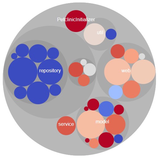
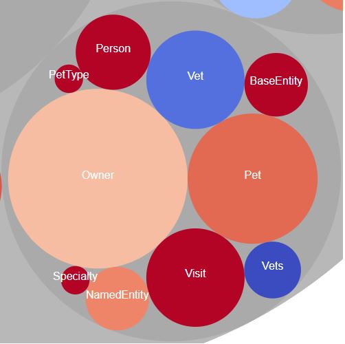
We can also deep dive to view all models (were we see the seldom used “Vet” feature)…
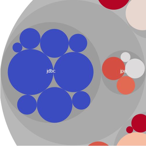
…as well as the unused code of the JDBC part.
You can even have a look at the live example.
Summary
I don’t know what you think (I would love to hear it!), but I think, it’s not much work to do such kind of analysis. For the first proof of concept, I needed around an hour from gathering the coverage data to the first bubble chart (including all the coding).
The key is to get enough representative data, so you have to enable JaCoCo directly in your production environments. The analysis part is easy. You are very welcome to try it out yourself! You can find the Jupyter notebook on GitHub.
I am aware that you investigated relationships between packages dynamically. There are a bunch of methods around to visualize software architecture statically. I can recommend to read this survey paper:
Caserta, Pierre, and Olivier Zendra. „Visualization of the static aspects of software: A survey.“ IEEE transactions on visualization and computer graphics 17.7 (2011): 913-933.
Hi Max,
Thanks, that looks great!
Pingback:My talk at JavaLand 2018 – feststelltaste
Pingback:SWOT analysis for spotting worthless code – feststelltaste
Pingback:How to find dead code in your Java services – Join Picnic